A book cover is a promise in picture form. Before anyone reads a single line, the cover tells them what kind of journey we are offering—mysterious, playful, serious, romantic, or bold. And because readers scroll fast, we usually get only a few seconds to earn a click. That’s why a strong illustration-led cover is not “extra”; it’s part of the product.
In this guide, we’ll walk through the full process—from the first idea to files ready for print and eBook—so we can move with clarity, avoid expensive revisions, and end up with a cover that sells.
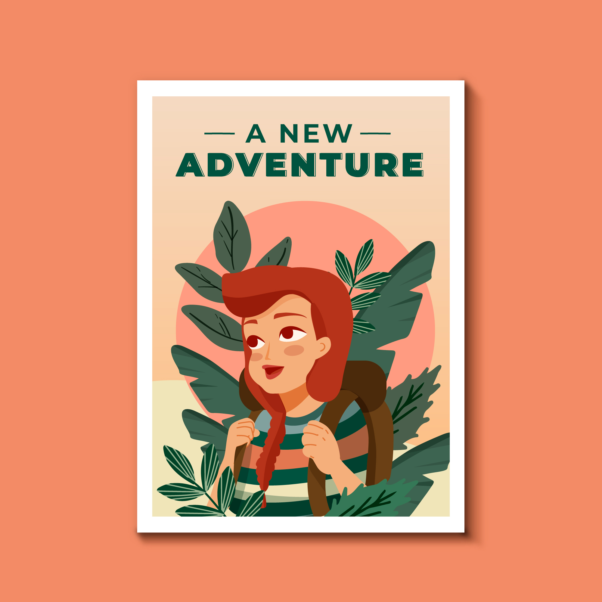
Why Illustration-Led Covers Still Win Attention
Illustration gives us control. We can show mood, symbolism, and story cues without being limited by stock photos or generic templates. It also helps a book stand out in crowded categories where many covers look the same.
When illustration is the best choice
- When the story world is unique (fantasy, sci-fi, magical realism)
- When we need a strong character presence
- When the tone is playful or stylized (especially for younger audiences)
- When we want a brand look across a series
How readers “read” a cover
Most readers scan:
- Genre signals (color, style, visual tropes)
- Title readability (especially on mobile)
- Emotional hook (curiosity, tension, warmth)
If we nail these three, we’re already ahead.
Step 1: Define the Cover’s Job (Not Just Its Look)
Before sketching, we should decide what the cover must achieve.
Clarify the target reader
Ask:
- Who is this for, really?
- What other books do they buy?
- What visual style do they already trust?
Write a one-sentence cover brief
A practical template:
Cover brief template
- This cover should feel like [emotion]
- It should signal [genre/subgenre]
- It should promise [core experience]
- It should avoid [wrong audience cues]
This sentence becomes our north star when feedback gets noisy.
Step 2: Research Like a Pro (EEAT Starts Here)
EEAT is not only about the writing; it’s also about how we make decisions. We build trust by showing we understand the market and the reader.
Do a competitive cover scan
Collect 15–30 top covers in the same category. Note patterns:
- Common color palettes
- Typical illustration style (flat, painterly, line art, collage)
- Character vs. object focus
- Typography trends
Build a mood board with purpose
A mood board is not a random gallery. We should label it:
- Mood references (lighting, emotion)
- Style references (brushwork, shapes)
- Composition references (close-up, full scene)
- Typography references (serif, sans, hand-lettered)
Step 3: Concept Development (Where Great Covers Are Born)
Now we turn research into ideas.
Start with 5–10 thumbnail sketches
Keep them small. Think of thumbnails like testing recipes before cooking a full meal.
What to test in thumbnails
- Focal point (what the eye hits first)
- Silhouette clarity
- Balance of title space vs. art
- Readability at small size
Choose a concept based on strategy
Pick the idea that best matches:
- Genre expectations
- Unique story hook
- Strong visual hierarchy
This is where we avoid “pretty but wrong.”
Step 4: Composition and Visual Hierarchy
A cover is a poster. It needs structure.
Use the 3-layer hierarchy
- Title (must read instantly)
- Main image (must hook emotionally)
- Details (reward a longer look)
Design for thumbnail first
Most sales happen after a tiny image view. So we should test the cover at 120–200px wide early.
Quick thumbnail test
If we blur the cover and still recognize the subject and title shape, we’re on track.
Step 5: Color, Mood, and Genre Signals
Color is not decoration; it’s messaging.
Match palette to emotion
- Warm palettes: comfort, romance, nostalgia
- Cool palettes: mystery, distance, tension
- High contrast: action, thriller energy
- Soft contrast: literary, reflective tone
Keep print reality in mind
Screens glow; paper absorbs. We should plan for slightly brighter midtones and check proofs when possible.
Step 6: Typography That Works With the Art
Typography is often the difference between “professional” and “amateur.”
Pick type based on genre and tone
- Serif: classic, historical, literary
- Sans: modern, business, contemporary
- Display/hand-lettered: playful, stylized, youthful
Avoid common type mistakes
- Too many fonts
- Weak contrast against the illustration
- Over-tight tracking
- Title competing with the focal point
Step 7: The Illustration Workflow (From Sketch to Final)
Here’s a clean production path we can follow.
Sketch phase
We lock:
- Pose and perspective
- Major shapes
- Lighting direction
Line art / refined drawing
We refine edges, fix anatomy, and clean tangents (those awkward near-touching shapes that look accidental).
Color and rendering
We build:
- Base colors
- Shadows and light
- Texture (subtle, not noisy)
Final polish
We add:
- Atmospheric effects (if genre-appropriate)
- Edge control (sharp where we want focus)
- Color grading for a unified look
Where “Book Cover Illustration” Fits in a Professional Process
When we talk about Book Cover Illustration, we are not talking about a single drawing. We are talking about a system: concept, composition, mood, typography, and production files working together.
How we keep Book Cover Illustration aligned with marketing
- We choose a concept that matches the shelf (category norms)
- We keep the focal point clear at thumbnail size
- We plan title placement early so art and type don’t fight
If we treat Book Cover Illustration as a marketing asset, not just art, we get covers that perform.
Children’s Covers: Special Considerations
Children’s covers have different rules because the buyer and the reader are often different people.
Design for two audiences
- Kids want fun, emotion, and clear characters
- Parents/teachers want quality, warmth, and age-appropriate cues
Working with Childrens Book Experts
If we want fewer revisions and a smoother path to a market-ready cover, it helps to collaborate with Childrens Book Experts who understand age bands, trim sizes, and what sells in each category.
They can guide choices like:
- Character proportions and expressions
- Color intensity by age group
- Readability for early readers
How to Illustrate a Children’s Book (Cover-Specific Tips)
When we discuss How to Illustrate a Children’s Book, the cover needs extra clarity. Kids do not want confusion; they want an instant story clue.
Make the main character readable fast
- Big expressions
- Clear silhouette
- Simple background shapes
Use storytelling props
A single object can communicate plot quickly—like a key, a map, or a glowing jar. Think of it like a movie trailer frame: one image that implies a whole adventure.
Keep detail where it matters
We can add texture and small elements, but only around the focal area. Too much detail everywhere is like everyone talking at once.
Step 8: Feedback Without Chaos
Feedback can improve a cover—or break it—depending on how we manage it.
Collect feedback in rounds
- Round 1: concept and composition
- Round 2: color and mood
- Round 3: typography and final polish
Ask better questions
Instead of “Do you like it?” ask:
- What genre do you think this is?
- What emotion do you feel first?
- What do you think the story is about?
These answers reveal whether the cover is doing its job.
Step 9: Production Files (Print + eBook)
A cover is not finished until it’s deliverable.
Print checklist
- Correct trim size + spine width
- Bleed (usually 0.125 in / 3 mm)
- Safe margins for text
- CMYK conversion and proofing
eBook checklist
- RGB export
- Strong contrast at small size
- Clean compression (no muddy gradients)
Common export mistake
If the title looks soft online, it’s often because the cover was downscaled poorly. Export at recommended sizes and let platforms resize.
Step 10: Series Branding (If This Is Book 1 of Many)
Series covers should feel like family.
Create a repeatable system
- Same type treatment
- Consistent placement of title/author
- Shared palette logic
- A signature illustration style
This is where Book Cover Illustration becomes a brand tool, not a one-off project.
Conclusion
A strong cover is a mix of art and strategy. When we define the cover’s job, research the market, build clear concepts, and follow a clean production workflow, we reduce guesswork and increase sales potential. Whether we’re designing for adults or planning How to Illustrate a Children’s Book cover with help from Childrens Book Experts, the goal stays the same: a cover that communicates instantly and earns attention.
FAQs
1) How long does a custom illustrated cover usually take?
Most projects take 2–6 weeks depending on complexity, revision rounds, and whether we’re building a full wrap (front, spine, back) for print.
2) What should we include in a cover brief for an illustrator?
We should include genre, target audience, comparable titles, key story elements to show/avoid, trim size, and any brand rules for typography.
3) Can we use the same illustration for print and eBook?
Yes, but we should export different file formats and color profiles. Print needs CMYK and bleed; eBook needs RGB and sharp readability at small sizes.
4) How do we know if the cover fits the genre?
A quick test is to place it next to top sellers in the category. If it looks “at home” but still has a unique hook, we’re in a good spot.
5) What’s the biggest mistake people make with illustrated covers?
They treat the cover like a standalone artwork and forget hierarchy. If the title and focal point aren’t clear at thumbnail size, the cover will struggle to sell.
For More Information You can Visit the home page for the website: https://skyfoxrz.com/


Freight Forwarding Services in Canada: How Progressive Cargo Simplifies Global Logistics
Freight forwarding plays a crucial role in today’s interconnected global economy. Business…


