Food perception starts before a person takes the first bite. Your eyes send early signals about freshness and quality. When food looks bright and well arranged it creates positive thoughts about taste. Color balance and plating style guide how people feel about flavor strength. Red and yellow shades often make food look hot and exciting. Cool shades like green or blue give calm and natural feelings. The way food is placed on plates changes how you think about quality. Neat arrangement makes a dish seem special while random placement feels careless. Food perception connects sight with satisfaction and shapes dining experience deeply.
How Do Colors Shape Human Food Choices?
Colors strongly affect decisions about what people eat. Bright food colors pull attention quickly and increase hunger feelings. A red sauce or golden crust builds energy and excitement for tasting. When color looks dull people lose interest even before eating begins. Visual signals from color tell the brain about flavor strength and freshness level. Balanced colors make food look organized and appealing at once. You can use color wisely to control emotion and focus. Restaurants across the USA use hot shades to raise appetite and customer comfort. Food perception improves when eyes find balance and pleasant shades together.
Why Is Plating Important For Food Perception?
Plating works as a silent guide for quality judgment. A plate that looks neat tells customers that care has been used. Each item should have space that allows a clear view of color and form. If food overlaps too much it looks confusing and less fresh. Clean surfaces with balanced shapes keep attention where it should be. Chefs plan plating style carefully to build confidence before tasting. Food perception depends on how sight links with taste memory and emotion. When food looks cared for people believe flavor will match appearance. Simple plating often wins because it feels real and honest.
How Do Light And Background Affect Food Presentation?
Light can raise or lower the impact of food appearance quickly. Strong light brings out bright colors and clean textures clearly. Dim light softens images but can hide key visual details from eyes. Background color also changes how food shades appear under light effect. A white base makes color pop while a dark tone adds hoth and focus. People notice food faster when lighting feels balanced with natural reflection. Food perception improves when brightness fits the color temperature of the dish. Many cafes plan light and plate choice together to create harmony. Your eyes respond faster when color and light agree naturally.
How Do Smart Products Help?
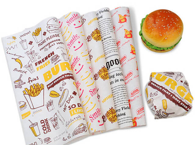
Food wrapping supports visual structure and keeps presentation clean for serving. Using eco-friendly wholesale custom wax paper adds both hygiene and smart appearance. It helps prevent stains that can affect food view during delivery or service. Clean wrapping also reflects care and modern responsibility toward the environment. Businesses find that neat wrapping builds more trust with buyers. It gives a safe layer that keeps visual details bright and clear. Food perception benefits when every layer looks professional and tidy. Small wrapping effort makes a big difference in how customers rate quality.
How Does Brand Support Better Food Display Standards?
Quality wrapping protects texture and form that influence food perception strongly. With organized serving methods customers find food more enjoyable and satisfying. Simple structure with smooth finish keeps food visuals consistent and attractive. Many restaurants choose such solutions to match hygiene with design strength. WaxPapersHub supports sustainable choices that also look neat in every service setting. When design supports visual value, customers remember the experience longer with trust.
How Does Color Psychology Work In the Food Industry?
Color psychology connects sight with mind reaction and buying habits. Each shade brings emotion that changes food perception faster than taste. Hot shades like orange and red increase appetite and make dishes lively. Cool shades like blue or green calm mood and signal freshness. Black or white contrast adds a modern sense that many cafes use. Smart color use can raise average order value and repeat visits. Designers plan color palette to guide emotional link with brand image. When colors match food type customers feel comfort and trust immediately. Correct shade choice builds lasting impressions through visual clarity.
Why Should Restaurants Keep Visual Consistency In Dishes?
Visual consistency builds identity and trust across every serving stage. Customers expect a similar look for the same dish across branches or orders. When colors and plating change too much people lose connection and trust. Consistent design builds memory that strengthens brand image with each visit. Many food chains train staff to maintain the same layout and color balance. It shows effort and care that support strong food perception among buyers. Consistency makes dishes easier to photograph and share on digital platforms. People value brands that stay uniform in quality and presentation always. A stable visual pattern increases reliability and satisfaction level.
How Do Cultural Factors Affect Food Perception?
Cultural background shapes how people react to color and form in food. Some regions link red with joy while others see white as pure and calm. Plating design changes across countries due to habits and beliefs around eating. In the USA people prefer bright colored food with clear visible ingredients. Food perception adjusts through shared customs and emotional learning over years. When brands respect local color meaning they connect with customers more easily. Simple cultural awareness improves trust in global food service work. Every culture sees beauty differently but neatness and clarity stay universal.
What Are the Main Benefits Of a Strong Food Perception Strategy?
Strong food perception builds repeat customers and better overall sales performance. When food looks fresh and is presented thoughtfully, people feel safe about eating quality instantly. Visual planning reduces waste because people finish food more willingly. A clear layout supported by custom paper placemats with logo also helps faster service and cleaner handling across business. It makes photography easier for digital marketing that builds reach naturally. Brands gain recognition through consistent presentation in both taste and sight. Customers remember experience through visual details that trigger emotion and loyalty. Good food perception leads to stable brand growth and better customer retention over time.
Conclusion
Food perception guides customer thoughts before tasting begins. Every visual factor from color to plating affects trust and desire strongly. Businesses that plan display and lighting carefully create lasting customer satisfaction. Using clean design and balanced color improves experience across every food service area. Brands that value appearance gain faster loyalty through small visual decisions. Each detail from plate layout to paper material matters equally in building trust. When care meets visual order it defines quality for both eyes and taste. Strong focus on visual clarity keeps food memorable and business reputation secure.
Freight Forwarding Services in Canada: How Progressive Cargo Simplifies Global Logistics
Freight forwarding plays a crucial role in today’s interconnected global economy. Business…


